NFTX launches its new (visual) identity
Today we’re launching the new visual identity for the NFTX DAO, created by designer Ben Pieratt in collaboration with ChopChop!
Today we’re launching the new visual identity for the NFTX DAO, created by designer Ben Pieratt in collaboration with ChopChop!
With this rebrand we’re adopting an entire new logomark & logotype for all NFTX associated products & platforms, as well as adopting the new visual language across all upcoming releases created by the DAO and its community.
Rebranding NFTX at such an early stage of the DAOs life cycle was done to create a unique, professional looking and recognizable brand that crosses over both the DeFi & NFT spaces for years to come.
Let’s dive in!
The new NFTX visual Identity
The new NFTX brand identity comes with a set of new logos, a distinct primary color palette and visual language. Together they strengthen the recognizabilityof anything the DAO produces.
Logomark and logotype
The new NFTX visual identity comes with both a logomark & logotype, giving the DAO and users of the logo(s) the highest amount of flexibility while staying recognizable in both cases.
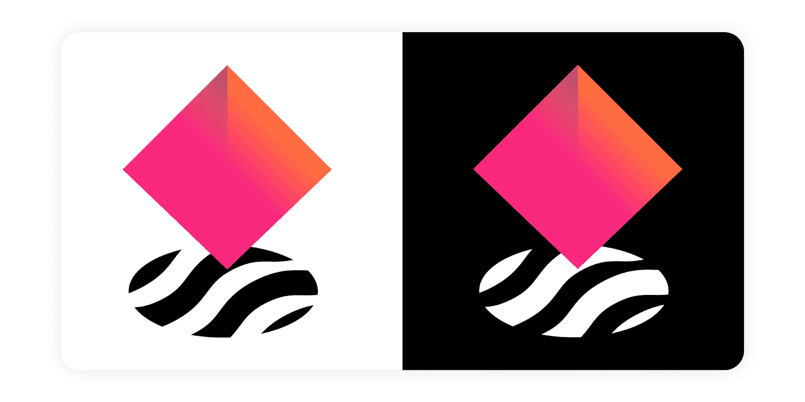
The logomark shows square shape in an orange-to-rose gradient, illustrating the unique non-fungibility of NFT assets. This square is paired with a circular shape created out of flexible black&white lines, illustrating the homogeneous fungible liquidity pools the NFTX creates for NFT assets.
Combined, the mark illustrates the intersection between the DeFi and NFT spaces.
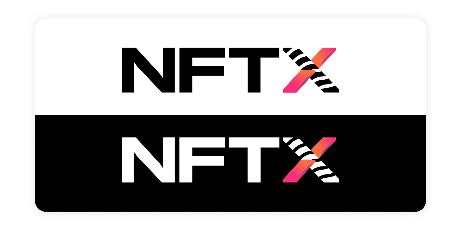
The logotype showcasing the NFTX brand name in full, using a sans serif font and illustrating the X, resembling a similar visual identity as its associated logomark shown above.
Color palette
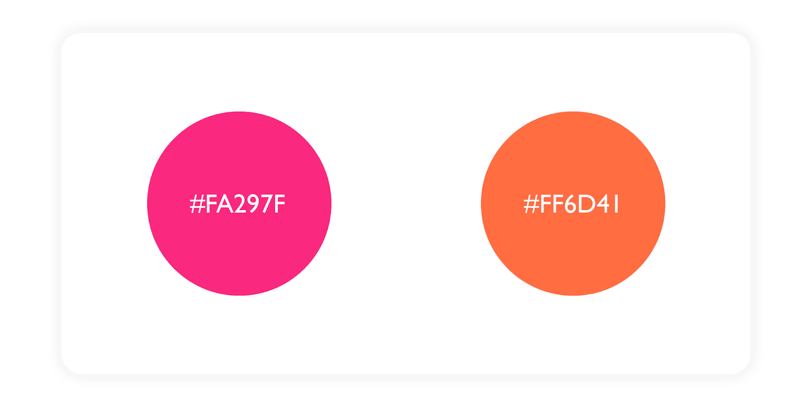
The current two primary colors for NFTX, digital usage, are outrageous orange (#FA297F) & rose (#FF6D41):
Reference to the NFTX emojis
As some early participants in the DAO may remember, choosing a recognizable (set of) emojis for NFTX was one of the first informal votes we launched on Discord.
Ever Since, the 🦧 orangutan emoji paired with the 🕳️ hole has quickly become synonym for NFTX in the broader community, resembling the intersection of where the DeFi community meets the NFT community.
Our new logomark resembles this intersection, with a wink to the original DAO community through the use of both colors and shapes referring to 🦧🕳️.
First integration: The NFTX Gallery
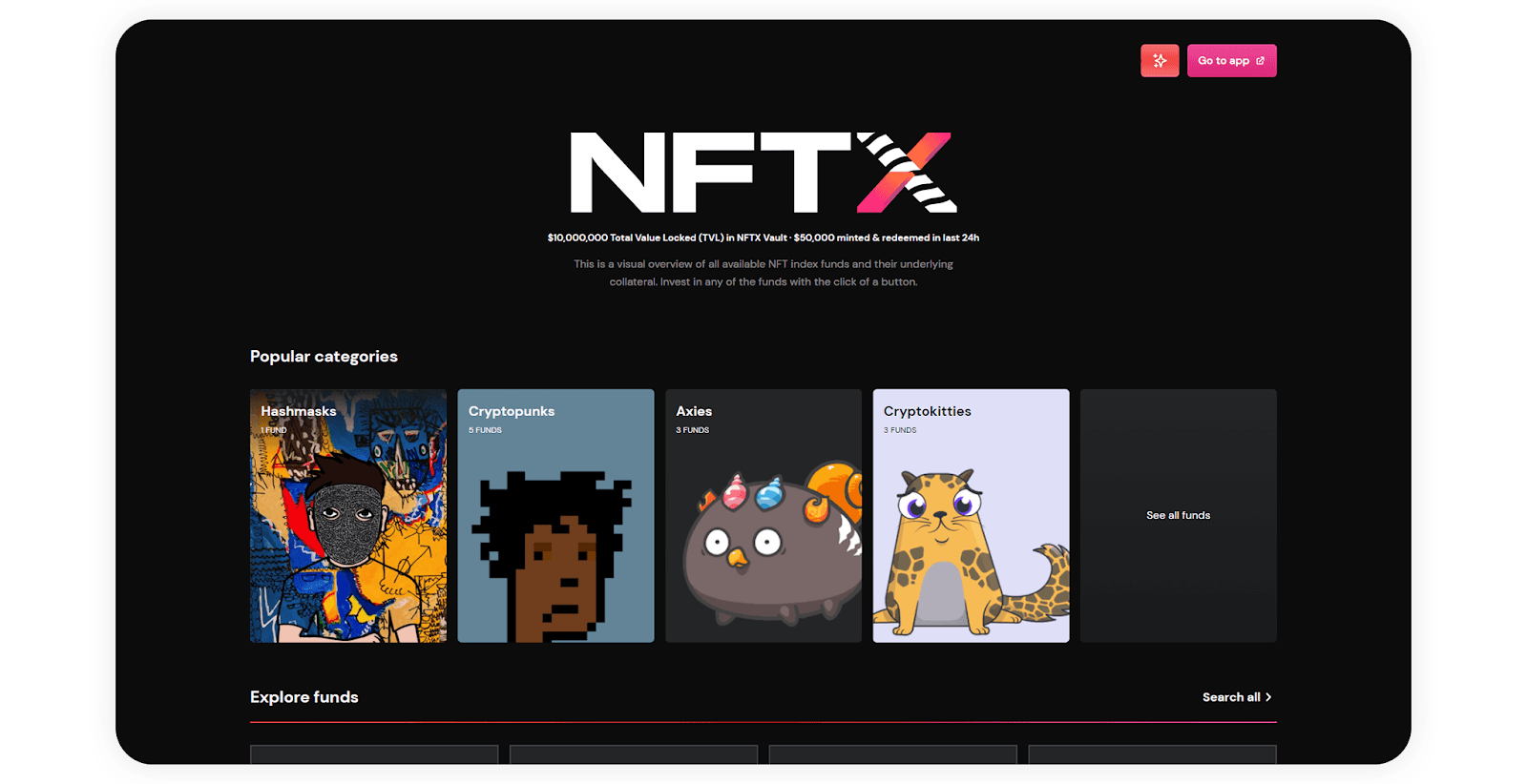
The gallery squad, who’s been extremely hard at work creating a new visual experience for investing & interacting with NFT index funds on NFTX, will be one of the first that utilize the new visual identity described above.
A sneak preview of the homepage, with new visuals, is shown below.
Watch back the entire process.
Love the new brand as much as we do and want to watch back how it came to existence?
ChopChop, together with designer Ben Pieratt, created the entire new visual identity on two (very long!) live streams broadcasted on Twitch. You can watch these back in their entirety through the links below.
Creative briefing & discovery: https://www.twitch.tv/videos/898101115
Final design process: https://www.twitch.tv/videos/900725055
And that’s it!
You can find the full brand kit on our documentation website.
Missing anything, have questions or are you looking to become an active participant/contributor in the NFTX DAO? Make sure to join us on Discord.